Phocas Island 2

Talk about our & your projects.
User avatar
Tormentor667
Stronghold Team
Posts: 3555
Joined: Sun Nov 13, 2005 23:15
Location: Germany
Contact:

Post by Tormentor667 »

Image
This is Ultima 8 Pagan, isn't it?
User avatar
TheDarkArchon
Posts: 1000
Joined: Wed Jul 06, 2005 11:58
Location: What's that fucking smell
Contact:

Post by TheDarkArchon »

ellmo wrote:
chopkinsca wrote:I decided to go with a stone look instead. Came up with this: [image].
Now it looks like it would break by the second time you hit something. The stone is definitely too much shattered.
I'd be more worried at where the cracks are: There almost directly across from each other making it a lot weaker structually which means it'll shatter quicker.
User avatar
chopkinsca
Posts: 183
Joined: Thu Dec 29, 2005 8:09

Post by chopkinsca »

Hmm... Well, until I feel like changing it again, it can be a magical axe that never breaks. It will fit in nicely with the magical stick that never burns out once set on fire.
User avatar
ellmo
DRD Team Admin (Inactive)
Posts: 237
Joined: Thu Jun 30, 2005 13:30
Location: Poland, Poznan

Post by ellmo »

chopkinsca wrote:Hmm... Well, until I feel like changing it again, it can be a magical axe that never breaks. It will fit in nicely with the magical stick that never burns out once set on fire.
You lazy ass :D
User avatar
chopkinsca
Posts: 183
Joined: Thu Dec 29, 2005 8:09

Post by chopkinsca »

Since this is a recreation of the first one, areas from the first can be recognized in the second. This time around I'm taking each small section from the first and making it into a larger equivalent. Of course I'm adding lots of new areas to go with the increase of each area's size. For one area, I thought I'd do a visual comparison in size, just for fun. The area is where you first enter the temple after the caves. The small clearing with a pond in it. Currently, this is what the size difference looks like:
[spoiler]Image[/spoiler]

I was bored when I did that and was stuck on ideas. It's hard to think of good puzzles that fit in without seeming like obvious puzzles.
User avatar
BioHazard
Posts: 408
Joined: Mon Jul 25, 2005 10:02
Location: Middle of California where there is no air.
Contact:

Post by BioHazard »

chopkinsca wrote:It's hard to think of good puzzles that fit in without seeming like obvious puzzles.
Very true.
That's the main problem I'm having with myst.wad.
User avatar
chopkinsca
Posts: 183
Joined: Thu Dec 29, 2005 8:09

Post by chopkinsca »

myst.wad eh? Sounds interesting, never played Myst though. Played maybe two adventure games in my lifetime. Maybe that's partially why it takes me a while to come up with good puzzles.

Hopefully I'll finish this though, even with how ambitious it is. Even now, I spend a lot of time just running around the maps because I designed them (try to) for wandering around. If I spent as much time working on it as I do in playing around in the levels, I'd have it finished by now. Once more of it gets done, I'm going to need a few testers to point out game flaws I missed out on due to knowing the maps so well. What's an obvious route to me may be someone else's "wander around aimlessly for hours wondering what to do".

I think I'll post the Hexen map that this project started out as. This was all I had before I converted it to doom. It's from a map that's over a year old, and I took a lot of it out (nothing layout wise though). This is like a pre-pre-pre alpha map, kind of like comparing the first tech demo of doom to the finished product. Anyway, here it is. It goes as far as a point where you fall down, but can't get out of the 'hole'. There are two pits, one has no detail, the other is the true end of the 'demo'. There is a boss fight in that pit, but I took it out.

Well, that's as close as I can get to releasing something for comments on how it works without releasing anything revealing, as the finsihed product will be something to experience at once, not in pieces.
User avatar
chopkinsca
Posts: 183
Joined: Thu Dec 29, 2005 8:09

Post by chopkinsca »

Hmm, I'll post another screenshot. I call this one 'Map Evolution". The first three parts are trying to find the map style I want to use. The fourth and final is trying to abolish the symmetry you can can see in the first three shots (the change isn't as noticable in the screenshot though).

Each shot came from a different time period in development. I work on areas all over the place, so some areas I leave until later before working on them. I'll spoiler the image because it's a bit tall (2400 px).

[spoiler]Image[/spoiler]
meh


Progess is going slow, but steady. It is starting to take shape as a playable mapset, instead of something to run around in. No idea how much I have left to do. As shown with my previous maps, I'll get to a finished state, and then decide to add another huge ass area. So far, only custom monsters are in (done by me, none of the MRW stuff). Don't worry, I put a lot of thought into the monsters and they should actually be fun to fight.
User avatar
chopkinsca
Posts: 183
Joined: Thu Dec 29, 2005 8:09

Post by chopkinsca »

Triple post, but who cares.

Image

Another image of an old area. The menu on the right is a scripted inventory, the menu on the left is a status display of certain levels. Either menu only shows for a few seconds, until you bring it up again. The status menu may or may not stay, the inventory will stay, as it is certainly needed. I've made a fair bit of progress, nearly wrapping up all of the second maps paths.

The current play time for me is around 15 minutes, but that is with me knowing exactly where to go and taking the shortest path when there are two different ways. I also haven't setup all the monsters, and I plan on reducing the walk/run speed a bit (not too much, but enough as these maps are meant more for paying attention then running through).
User avatar
Tormentor667
Stronghold Team
Posts: 3555
Joined: Sun Nov 13, 2005 23:15
Location: Germany
Contact:

Post by Tormentor667 »

Looks awesome!
User avatar
Paul
DRD Team Admin (Inactive)
Posts: 1058
Joined: Thu Jun 30, 2005 13:30
Location: Poland - Grojec / Radom
Contact:

Post by Paul »

Without any doubts for that matter.
User avatar
MR_ROCKET
Posts: 35
Joined: Sat Sep 17, 2005 18:04
Contact:

Post by MR_ROCKET »

Wow yeah that looks nice, I like the shadowing you did with the sector lighting in one of the other shots on page1 ;)

It's a nice sky texture, though I think as a whole it may contrast better with a darker sky.
Possibly the same but a darker version of it? Because of the sector light levels, it could almost be moon lite to me.
Good looking cave entrance an stuffs. Nice work.:)
User avatar
chopkinsca
Posts: 183
Joined: Thu Dec 29, 2005 8:09

Post by chopkinsca »

Well, the sky isn't final. It's just the one I left in there when I first moved to GZDoom and was trying out skyboxes. About the light levels, there were a few times I've changed the light level setup. Most of the screenshots (I think) have the brightest outside areas at 160. Now, in the last one, it's 180. I'm putting a lot of care into light levels, and trying to avoid what I did in the first Phocas by having very dark sectors (my excuse was that caves are dark). Currently, I'm using 120 as the darkest sector you'll be in. Of course it all depends on what light mode you run GZDoom in. I find the 'doom' lighting has the best look for sector lighting that's setup well.

The last shot is probably one of the more cramped outdoor areas right now. The high walls on all sides make it that way.

Thanks for the comments.
User avatar
MR_ROCKET
Posts: 35
Joined: Sat Sep 17, 2005 18:04
Contact:

Post by MR_ROCKET »

Ah I see, well it looks nice, and np heh.
Keep up the grate work you'v been doing. :)
User avatar
chopkinsca
Posts: 183
Joined: Thu Dec 29, 2005 8:09

Post by chopkinsca »

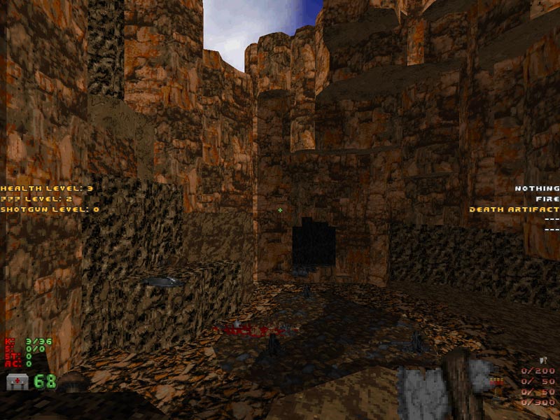
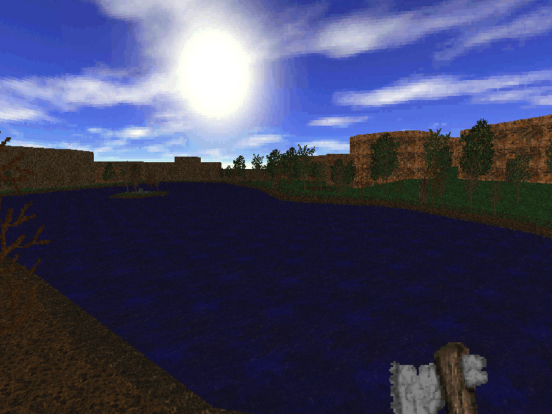
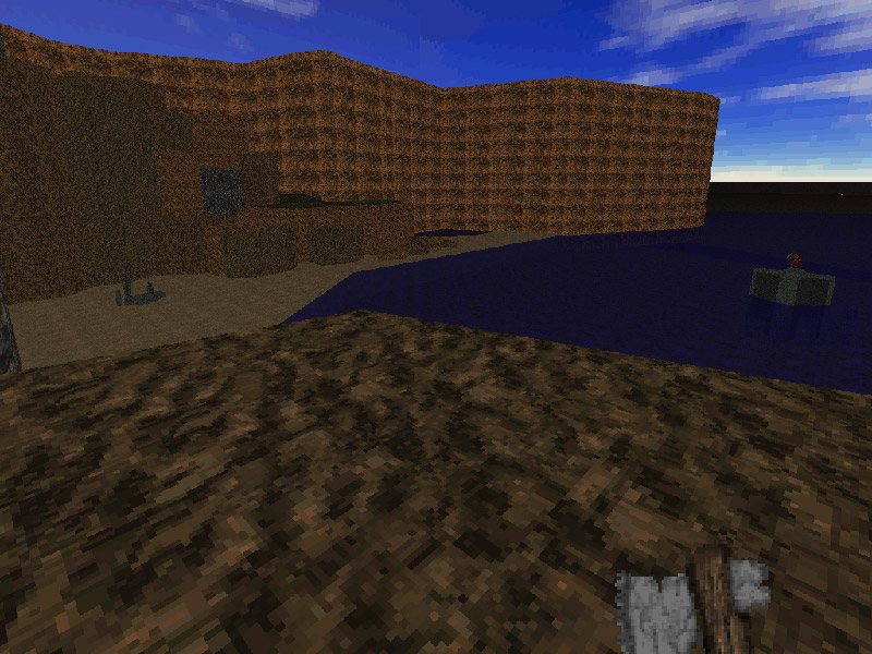
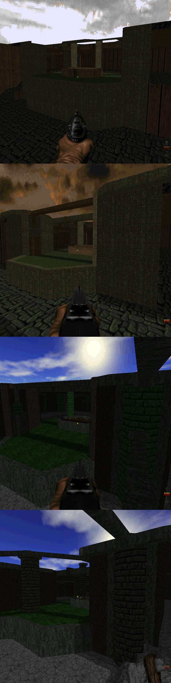
An update I suppose. The first two screenshots are from a largely unfinished map, the rest are from the first map. The screenshots don't reveal much, but at least are something to look at. Brightness/contrast might be a bit off, as I had to adjust it to seem bright enough on this dark monitor.

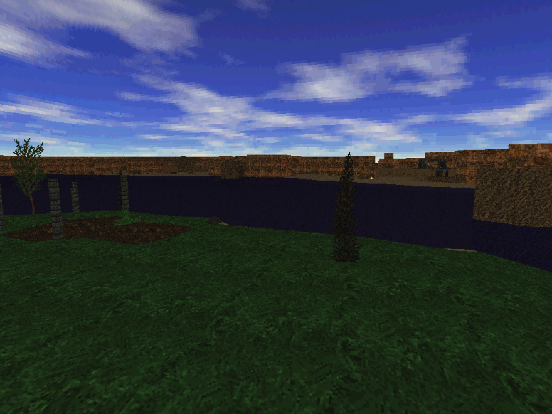
[spoiler]First, a nice, clear, blue lake. Yep, nothing special about it (well, it seems that way in the image).
Image


Next we have a beach on the cliff-like area of the island. It's a remake of the beach in the first .wad where you find the blue key.
Image


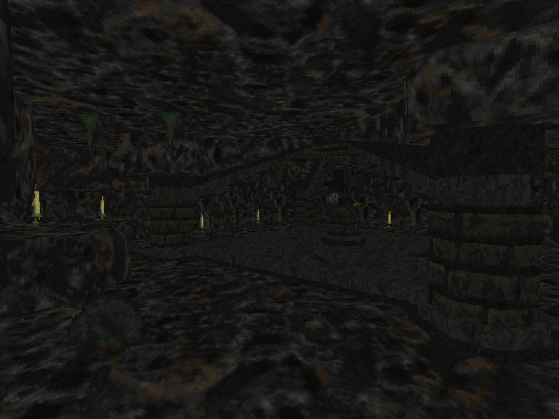
A cave with an alter of some sort.
Image


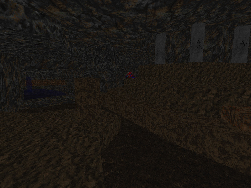
Another cave which has some importance depending on which path you take.
Image


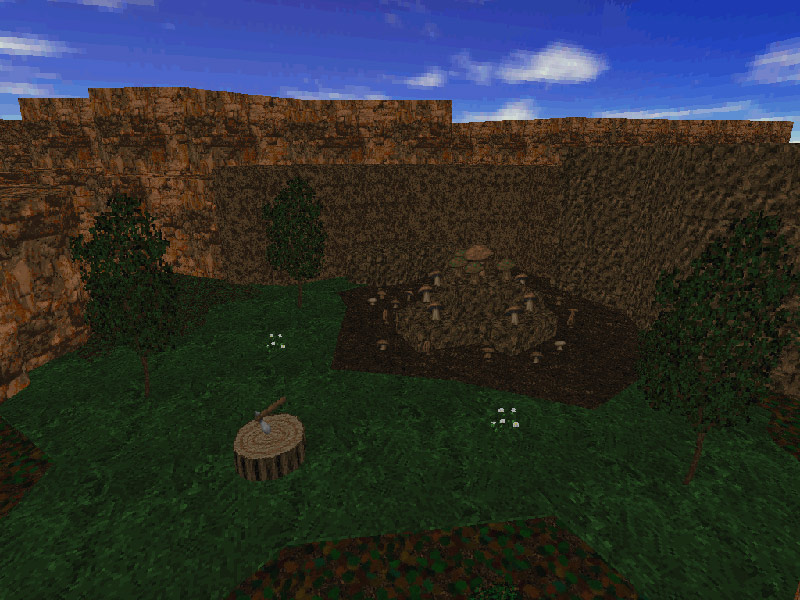
Just an ordinary set of mushrooms and an ordinary stump with an axe in it.
Image


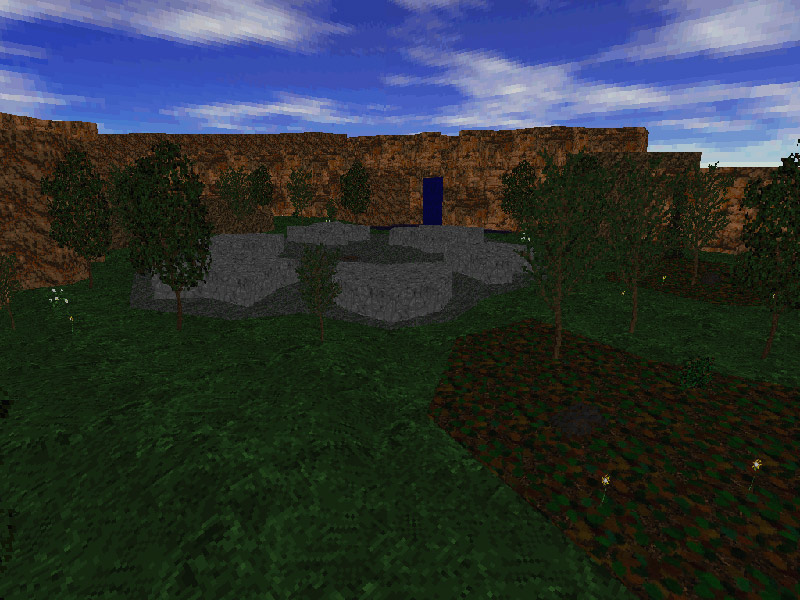
Small ruin on a small island.
Image


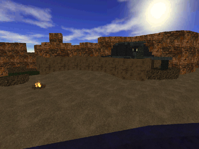
Ruins on the beach, complete with alter & candles.
Image


Another set of old ruins, mysterious as always.
Image[/spoiler]


Progress wise, I can see an end (but doesn't mean it's near finished). I have most of the maps finished (there'll be 6), just needs details. The puzzles/paths are mostly complete for about 4 of the maps. A current playthrough time takes about 45 minutes with me knowing exactly where to go (getting lost is hopefully part of the charm). The main thing that's slowing me down right now is ideas for monsters. Currently, not one single object is a standard object, all are decorate objects done by myself. Since I'm not trying to make it like doom, I don't see any point in using the stock doom monsters. Doesn't mean there won't be doom monsters, just not as you are used to them (since part of this mod is about individual battles, whether it's with a monster, or with the island itself).
Post Reply

Return to “Projects”